Campo de’ Fiori is a communal site in Rome, Italy. Translated from Italian, the name means “field of flowers.” The area is famous for its daily street market and has a rich historical background.
In the morning, the piazza is home to the city’s most colorful open-air market. In the evening, the area becomes an active nightspot with its square-side cafés, restaurants, and bars.
Campo de’ Fiori
Logo Design + Brand Identity + Stationery + Print Collateral + Iconography + Signage + Web Design
Campo de’ Fiori is a communal site in Rome, Italy. Translated from Italian, the name means “field of flowers.” This dates to the Middle Ages when the area was a meadow. Since 1869, a flower, fruit, and vegetable market has been held daily in the square. At night, the area is a meeting place for tourists and young people coming from all over the city. This personal project works to promote the culture of Campo de’ Fiori and the influence that time of day has on the site.
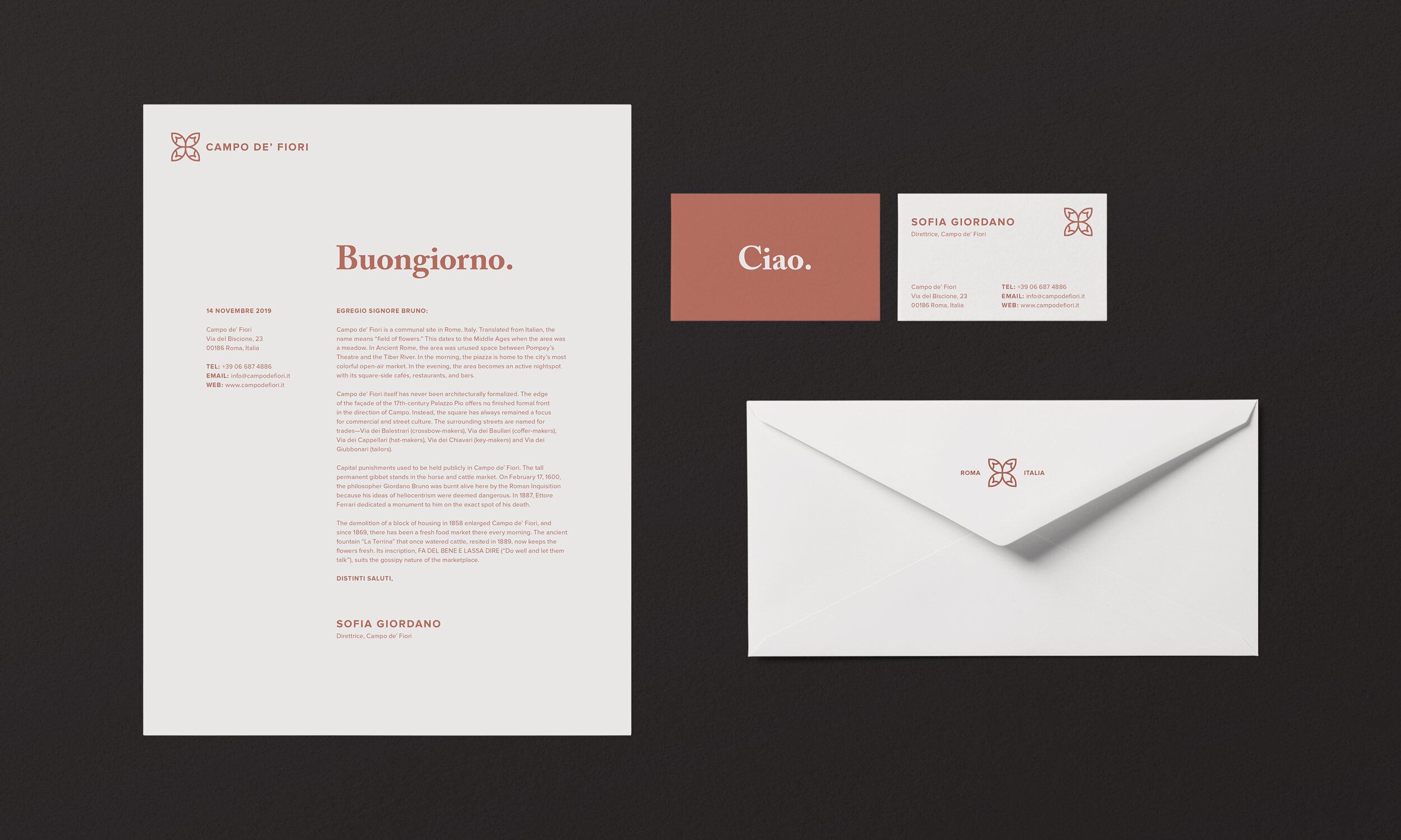
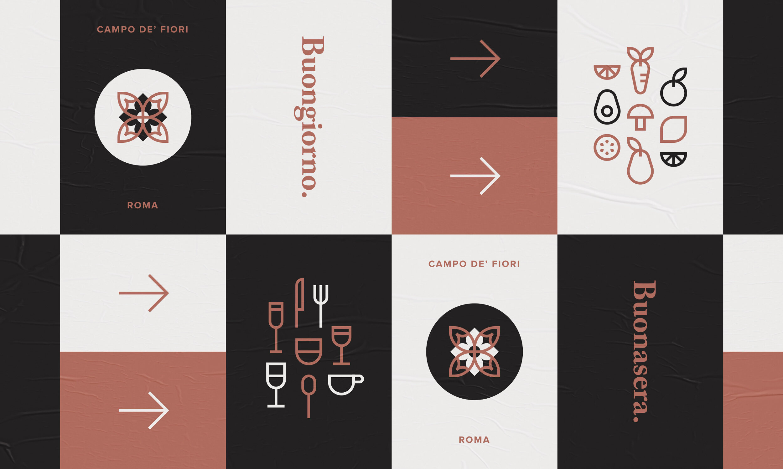
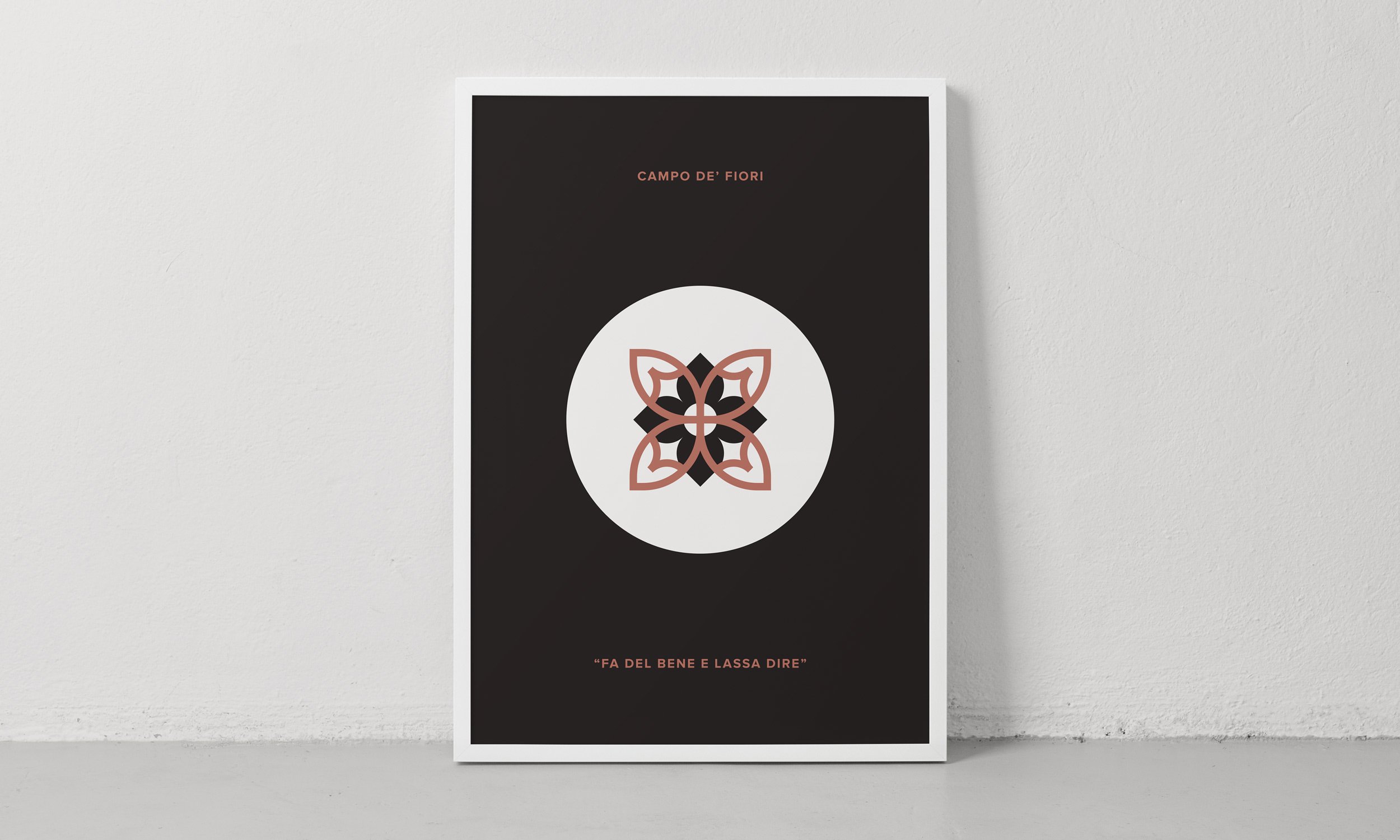
The logomark was inspired by the name of the site as well as the fresh flowers available at the market. The color palette, iconography, and messaging highlighted the contrast of day and night. In addition to the brand colors Cannoli Cream and Cobblestone, Terracotta was selected to add warmth to the palette. Icons were made to represent the market during the day (fresh fruit and vegetables) and cafés, restaurants, and bars at night (a variety of drinks and flatware). Italian greetings like, “Buongiorno.” and “Buonasera.” created a friendly tone throughout.
The collection of elements above includes a stationery system, wayfinding posters, a site map, a website, and promotional merchandise. In addition, a handmade process notebook was created while studying abroad in Rome, featuring personal research notes, sketches, watercolor paintings, photography, and proportional diagrams of the site.
Credits
Client: Personal Project
Designer: Stephanie Braun


