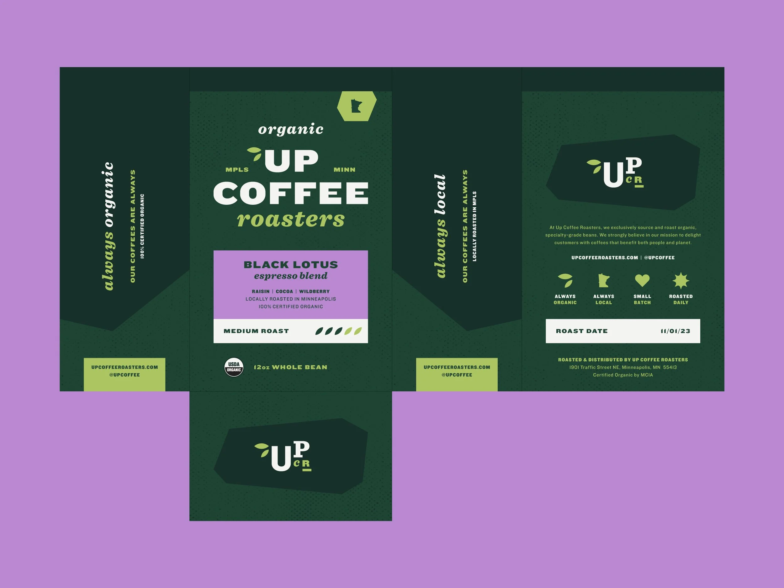
Located in Northeast Minneapolis, Up Coffee Roasters is a café and roastery that exclusively sources organic, specialty-grade beans. They wanted a rebrand and new packaging with a bold yet approachable look and feel, emphasizing, “Always organic. Always local.”
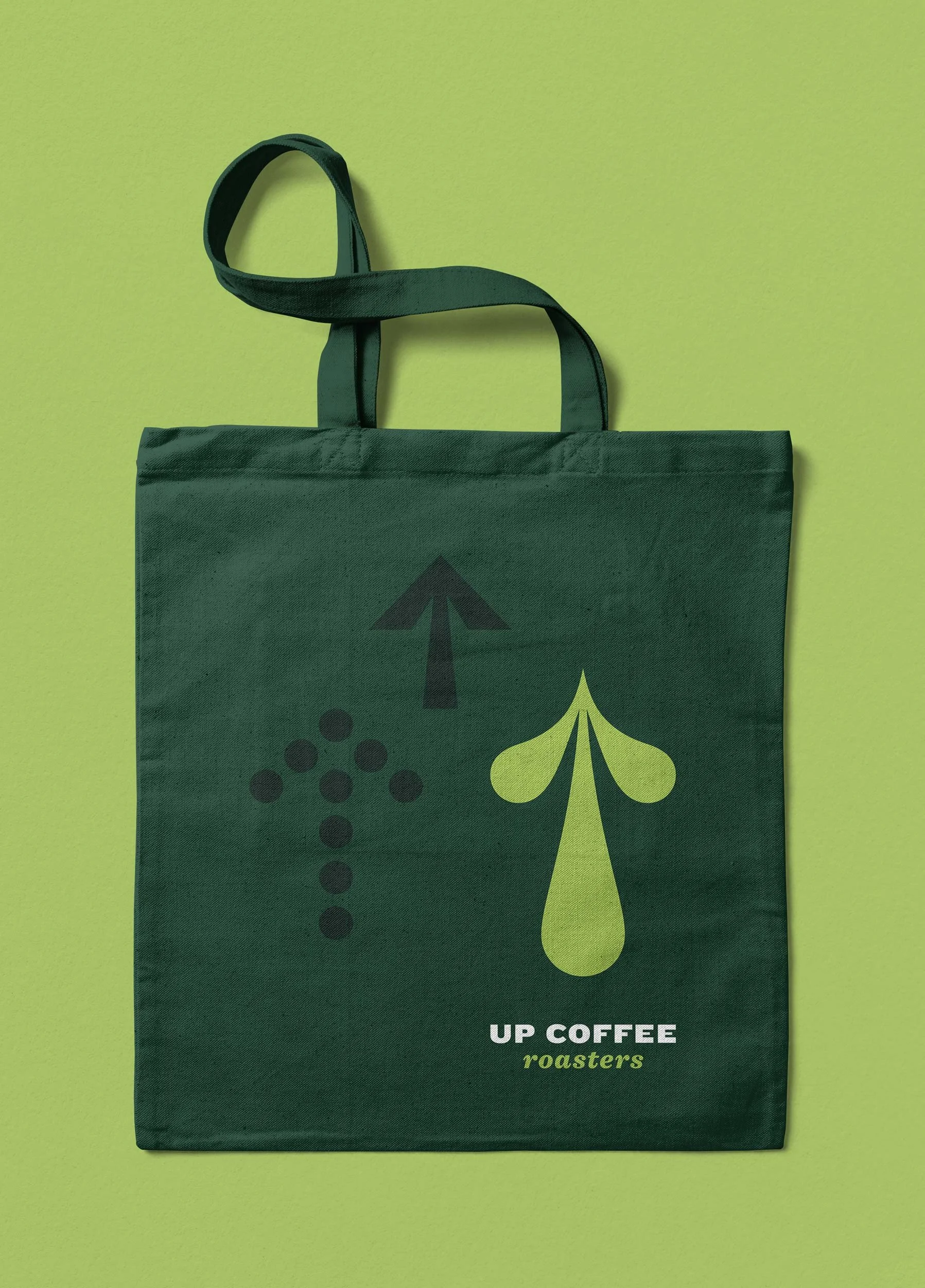
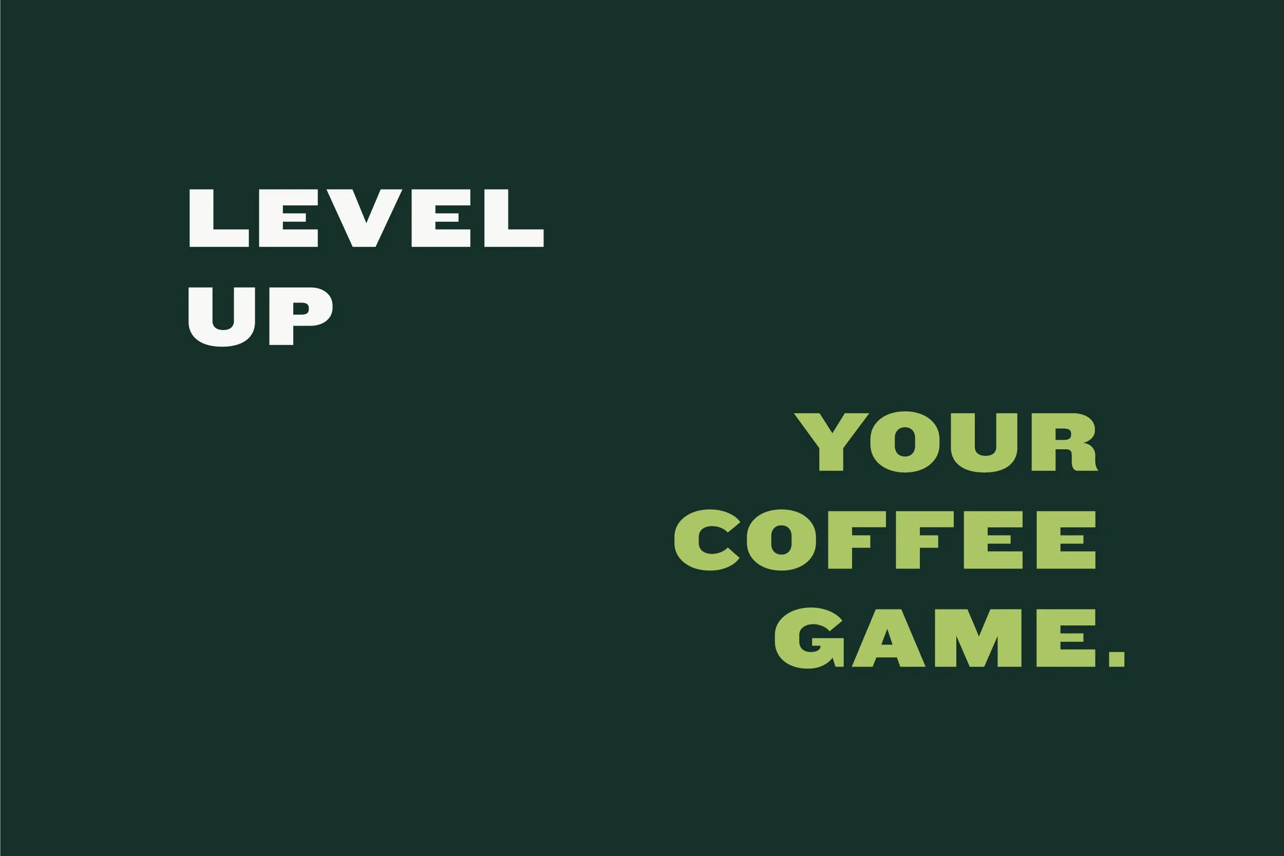
The arrow graphics and stacked typographic treatments paired with the phrase, “Level up your coffee game.” elevate the Up Coffee Roasters brand and give a greater sense of depth and meaning to their name — a vital piece missing from their previous brand identity.
Up Coffee Roasters Proposed Rebrand
Logo Design + Brand Identity + Packaging + Print Collateral
Established in 1993, Up Coffee Roasters has over 30 years of experience in the coffee industry and is the region’s leading provider of organic, specialty-grade beans. They wanted a rebrand to appeal to a broader audience and hold their own against their competitors in a retail environment. They also wanted to incorporate an organic look and feel, highlighting that their coffees are always locally roasted in Minneapolis.
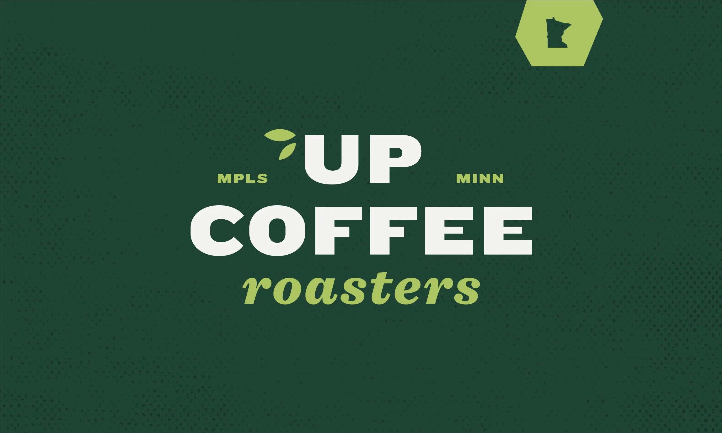
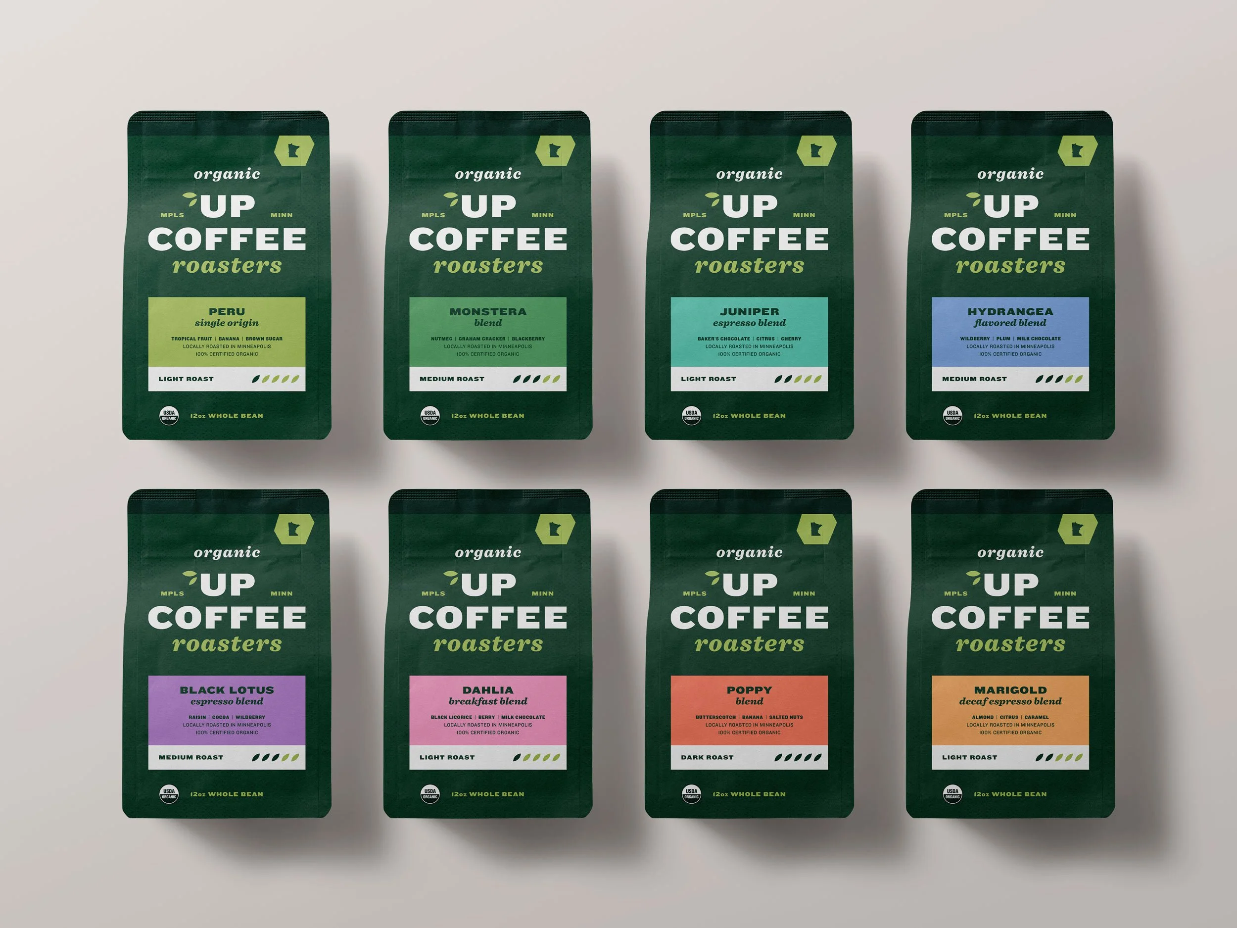
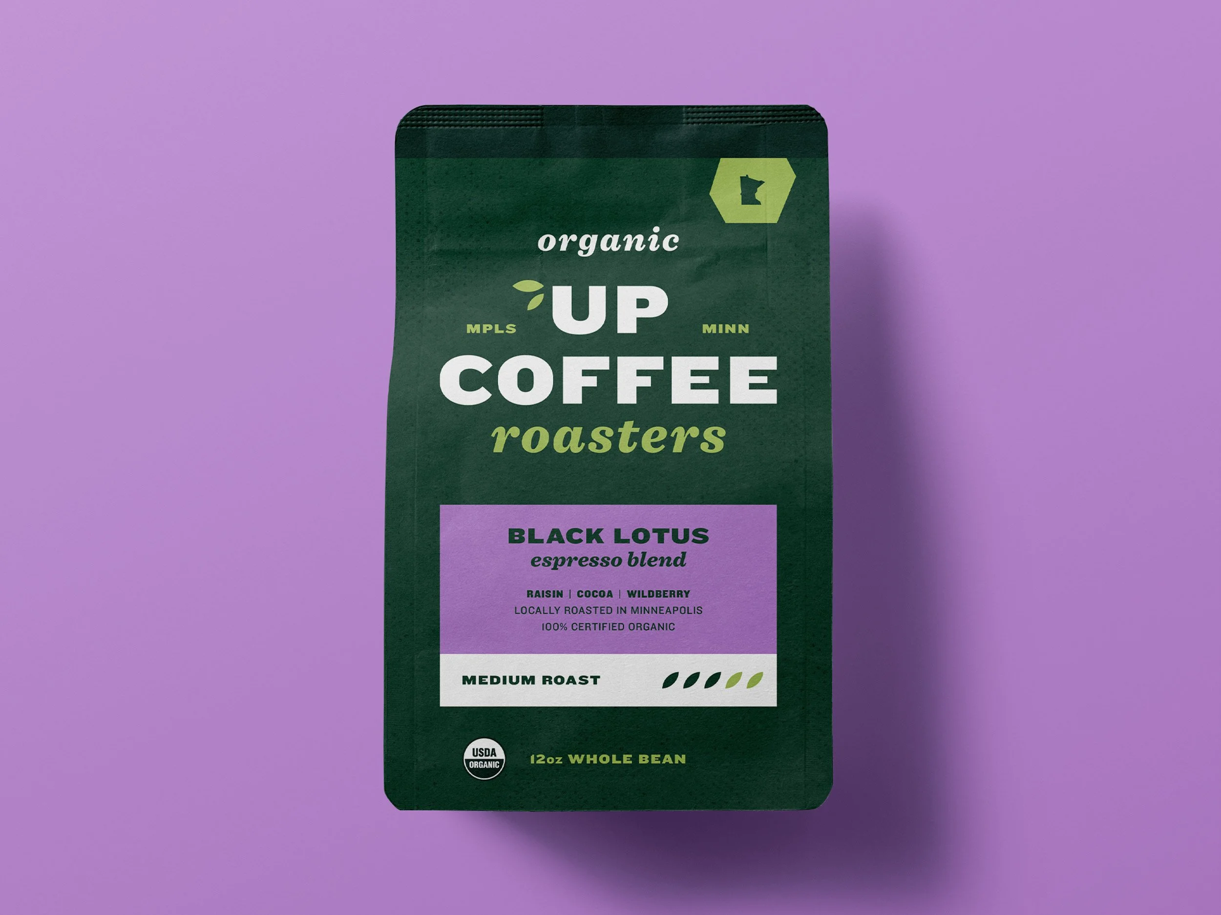
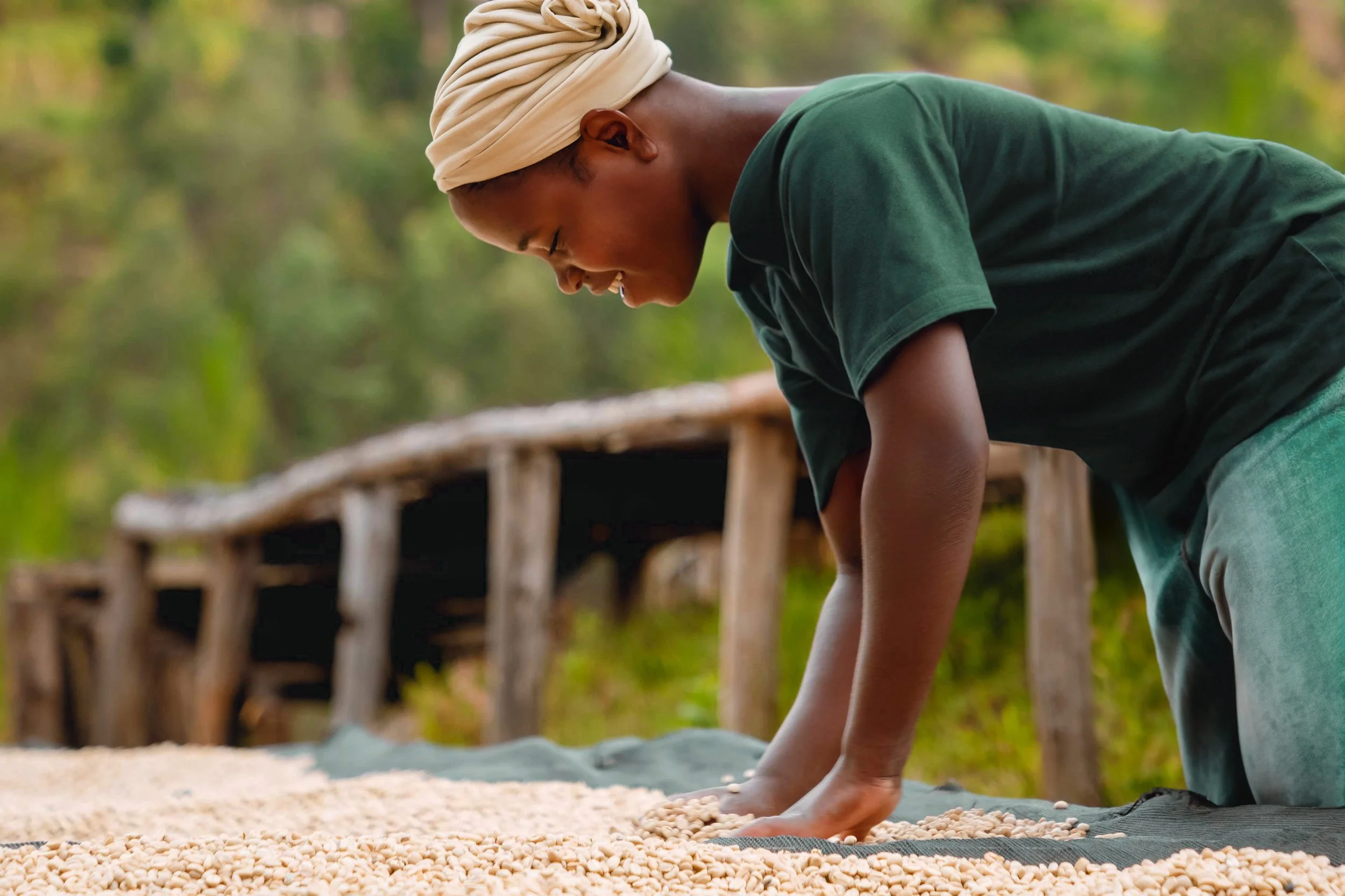
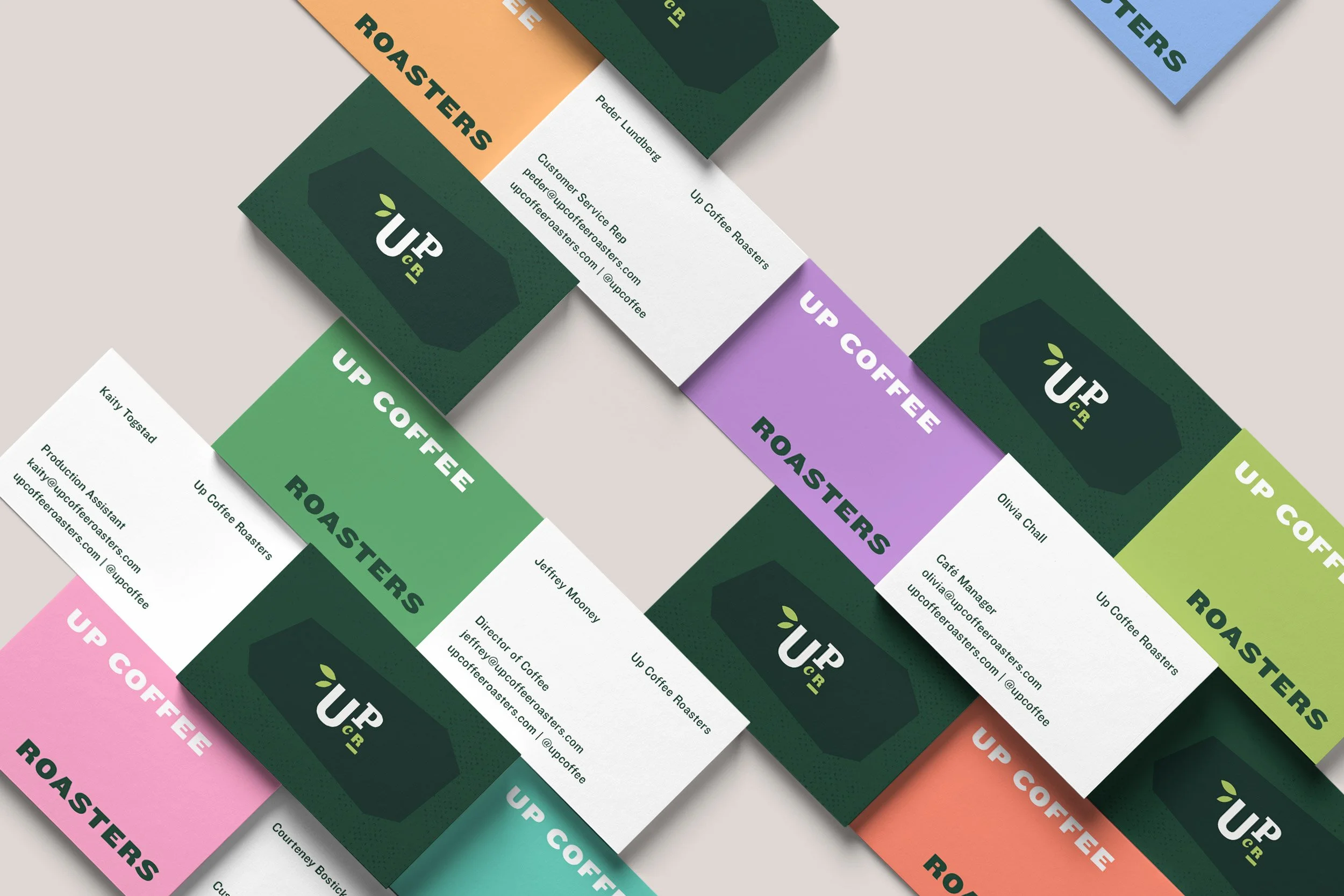
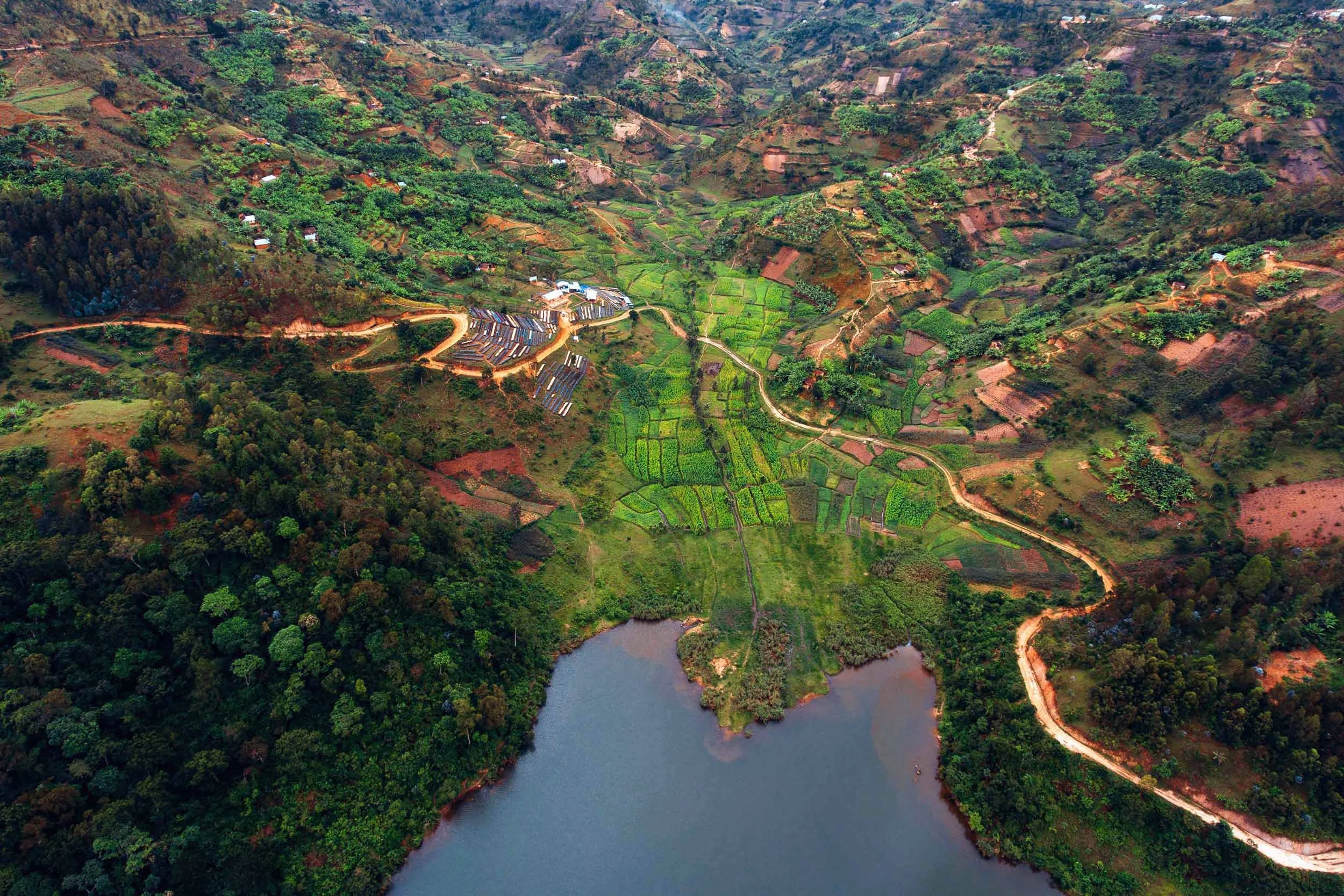
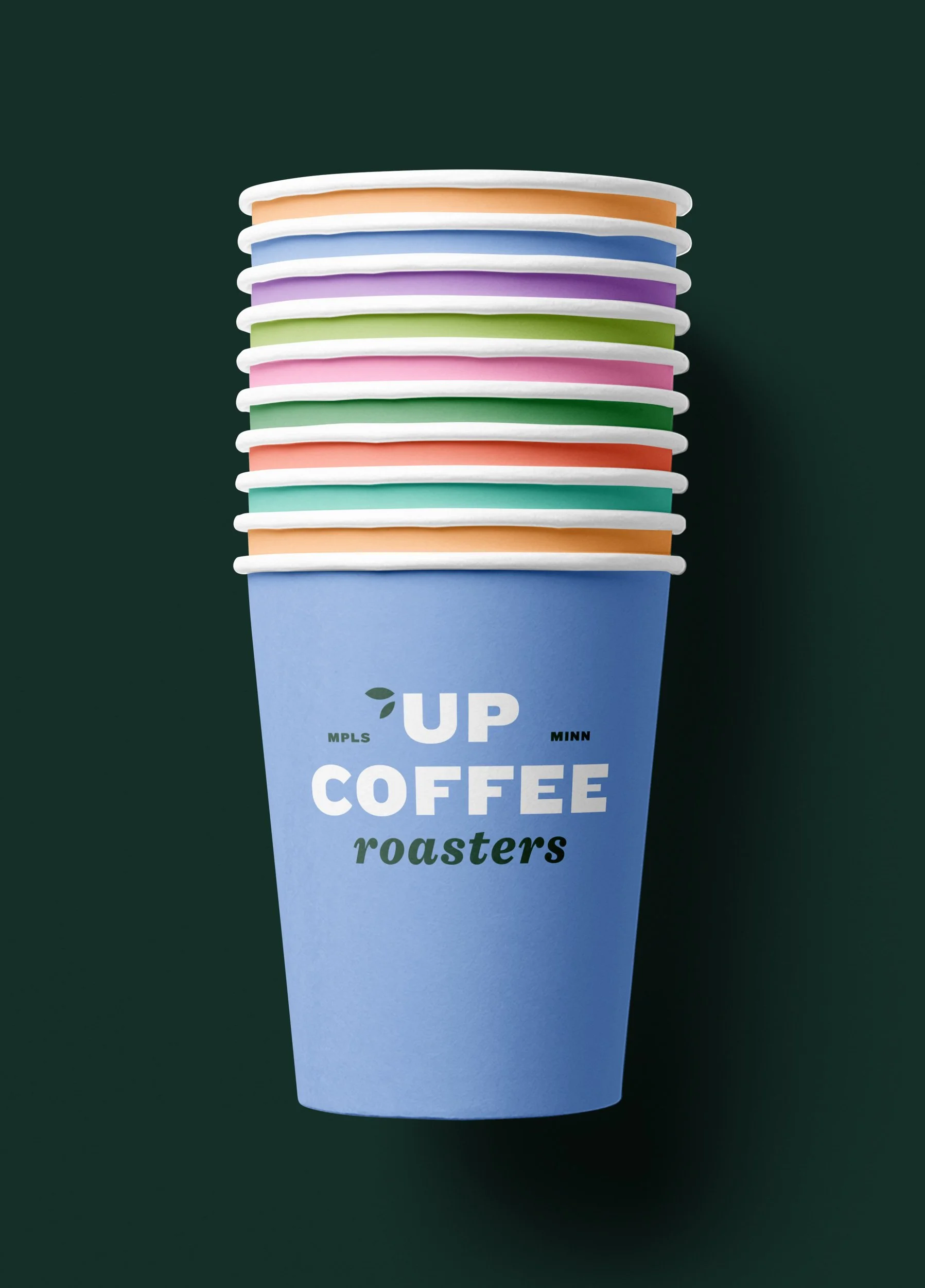
This system is a seamless transition for the Up Coffee Roasters brand. A new logo and variations were designed to create a friendly, welcoming feel. Preserving their iconic bright green, three new primary colors were added: two dark greens and cream, diversifying the palette and tying to their organic roots. Secondary colors are bright and playful, reflecting their cheerful disposition. The image style is saturated, complimenting the brand palette. Dynamic typography and graphics add depth and interest.
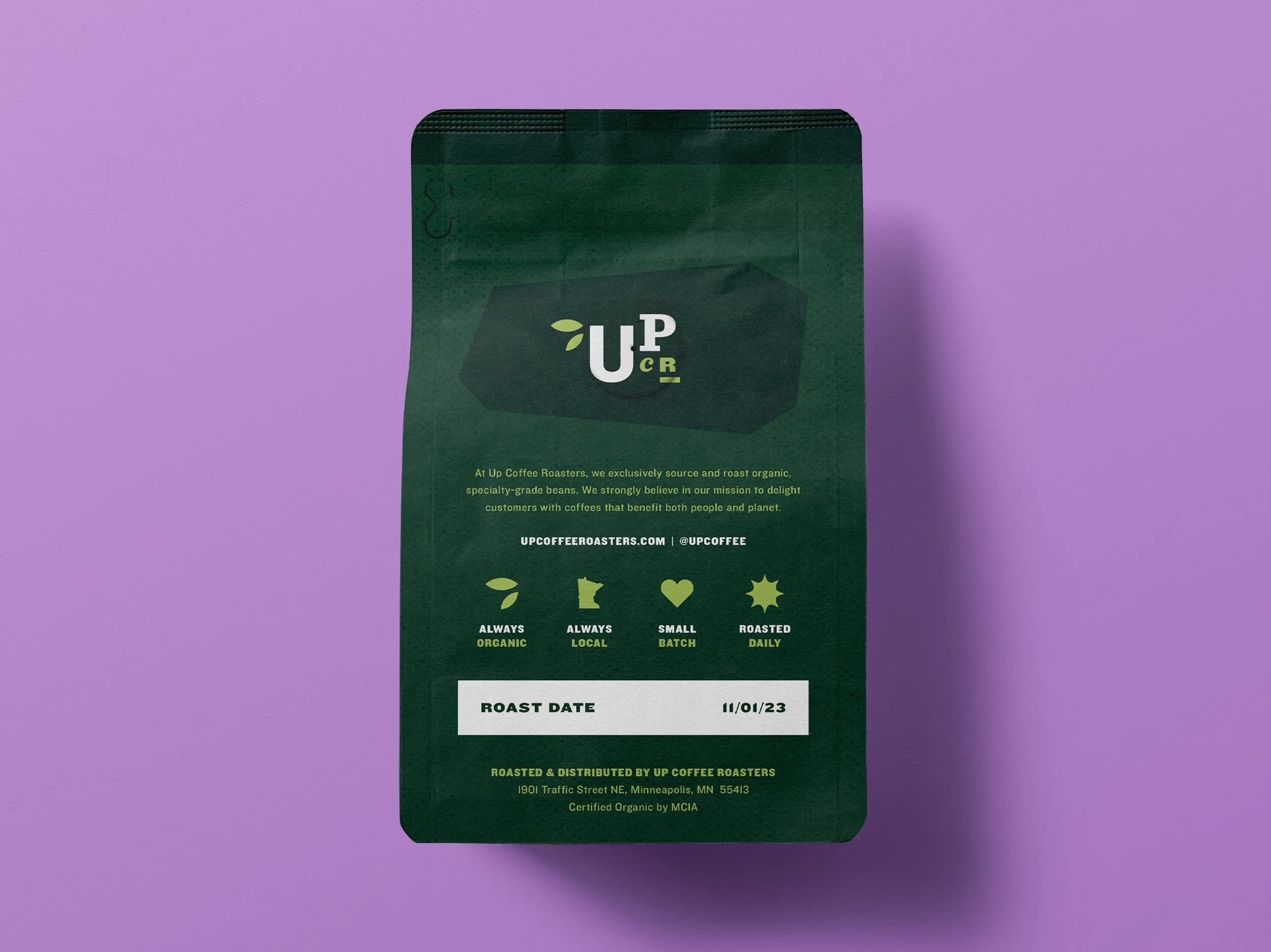
The use of green throughout paired with the leaf graphic, Minnesota state outline, and phrase, “Always organic. Always local.” inspire the audience to seek a better overall quality and experience from their coffee. It also encourages folks to shop local—a sentiment shared by many Minnesotans.
Credits
Company: FairWave Specialty Coffee Collective MN
Brand: Up Coffee Roasters
Director of Marketing: Jess Iverson
Designer: Stephanie Braun

